Prism
Design system and component library with colours, typography, buttons, forms, and more
Client
Interactive Demo
8 categories
Component sections
Dark + Light
Theme modes
What needed solving
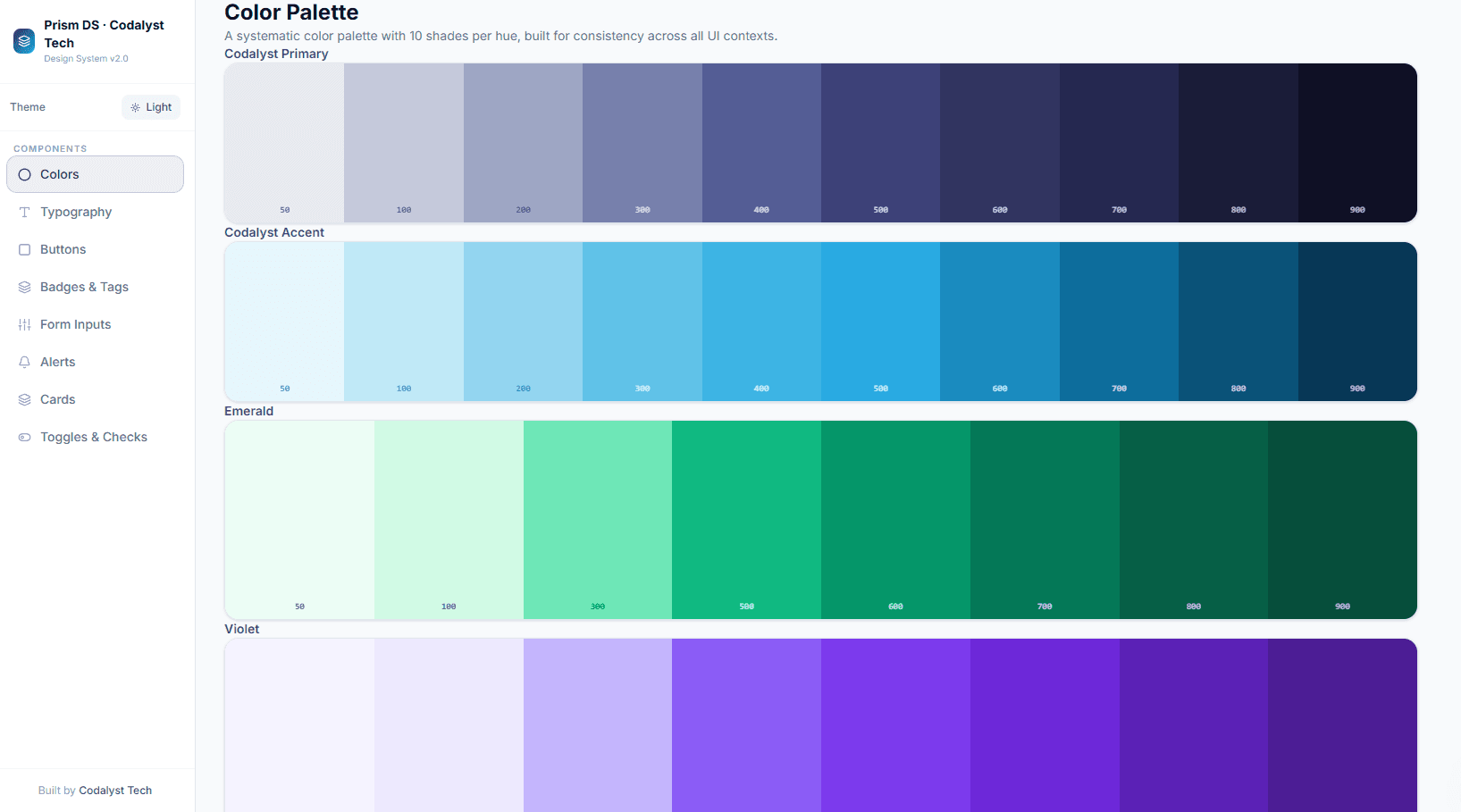
Product teams need a shared visual language , consistent colours, type scale, component states, and interaction patterns , documented in a living, interactive reference rather than a static Figma file.
How we approached it
A comprehensive design system showcase covering the full Codalyst Tech design language: colour palette with all shades, typography scale, button variants and states, badge types, form inputs with validation states, alert patterns, card layouts, and toggle/checkbox components , all interactive.
How we built it
A sidebar-navigated single-page app where each section renders live component previews alongside copy-able usage examples. Dark mode switches the entire system to a slate-950 palette, showing how every component behaves in both themes. The colour swatch section adapts to show contrast-appropriate text labels.
What we delivered
A living design system demo that prospective clients can use to understand the visual quality, consistency, and craft we bring to every component we build.
8 component sections fully documented and interactive
Dark mode applied consistently across all components
Copy-able class examples for every pattern
Full colour palette with primary, semantic, and neutral scales
Technologies Used
See it live
This is a fully interactive demo, not a static mockup. Click around, try all the features.
Open Prism DemoHosted at prism.codalyst-tech.com
More Work
Other products we've built
 SaaS Product
Analytica
SaaS analytics dashboard with real-time metrics, revenue tracking, and user management
View case study
 Business Tool
Orbit CRM
Client relationship manager with deal pipeline, contacts, and activity tracking
View case study
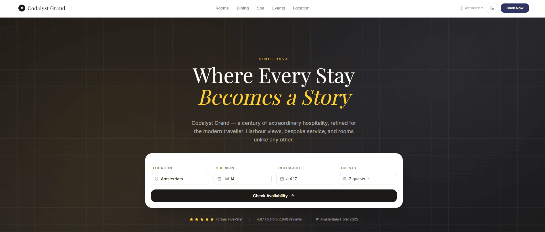 Hospitality
Luxe
Luxury hotel booking platform with room filtering, booking flow, and confirmation
View case study
Want Something Like This?
We build production-quality products for clients worldwide: SaaS dashboards, POS systems, AI tools, and more.